One of the most common accessibility issues flagged is colour contrast not meeting accessibility standards.
What is it?
The colour of the text does sufficiently contrast the colour of the background, making it difficult to read for users who are colour blind or have low vision
How Do I Fix It?
There are several different tools you can use to check the contrast of your colour scheme, Phew recommends using ColourContrast.cc. This tool allows you input the two colours you're looking to use, as well as changing the font, and will confirm whether the colour scheme passes accessibility standard and to what level.
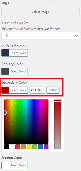
In order to complete the check, you will need to find the hex code for your colours - every individual colour has a #code, which can be found by going to the Customise in the WordPress admin area, and locating the Theme Styles button. This will then show the colour listed on the site, and the hex code can be found by clicking on the chosen colour:
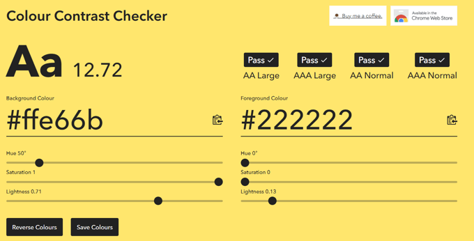
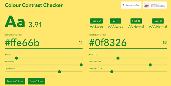
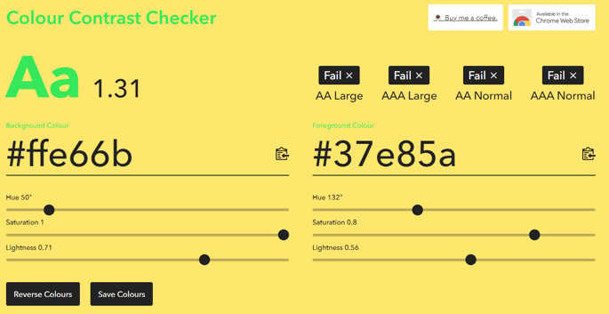
You will then need to add your hex codes to the checker, and you will be given instant results:
Full AA/AAA Pass:
Passes AA and AAA for both large and normal-sized text
Partial AA/AAA Pass:
Passes AA for large text, but fails at all other levels
Full AA/AAA Fail:
Fails AA/AAA at all text sizes
You can then make adjustments to your colour scheme in the Customise section of the WordPress admin.
Looking for further support on colour contrast, or any other aspect of accessibility? Email our helpdesk on support@phew.org.uk